
It’s a running joke in my gaming group that I have repainted my Warhammer collection so many times that I have the most efficient money expenditure vs hobby time rating possible. Being colourblind probably has a significant weighting behind that – as there’s times I can’t even see the colours I’m painting until it’s all finished and there’s enough on the model to enable my brain to “snap to” the colours in question. Ironically I’m Red/Green colourblind, which means that I’m also impacted with Blue/Purple and, Green/Brown. The other day I asked my wife what colour a watch strap was because for the life of me I couldn’t work it out – turns out it was a warm grey, so part of me thinks that either the colourblindness has somehow gotten worse, or that after 39 years of fumbling through colour identification, my brain has just decided to respond with “I’m tired boss”.
Night Lords were an 8th Edition Warhammer 40,000 Army for me… But I swiftly moved to Heresy, and left my Aeldari as my 40K army – which is Mymeara and dusty Mymeara at that.
My Night Lords started off as a dark metallic blue, with shading done using Citadel Shade paints, and evolved over several repaints through to my time on the30kchannel with James facing off against his Emperors Children. Then I went down a more high contrast path, using many inks, full pigment paints and different techniques. Finally, I’ve ended up on a quite simple scheme where I get to fill my boots using some nice blue paints and inks… and it achieves the effects I’m after, whilst being repeatable. I’ve combined it with my early metallic scheme lightning, so it’s a bit like a Seiko SPB453 1965 Revival watch – it has all the best bits over the years with some uniqueness thrown in. And I love it.
Anyway – time for a very brief canter through some of the main schemes over the years, ending with the current one.
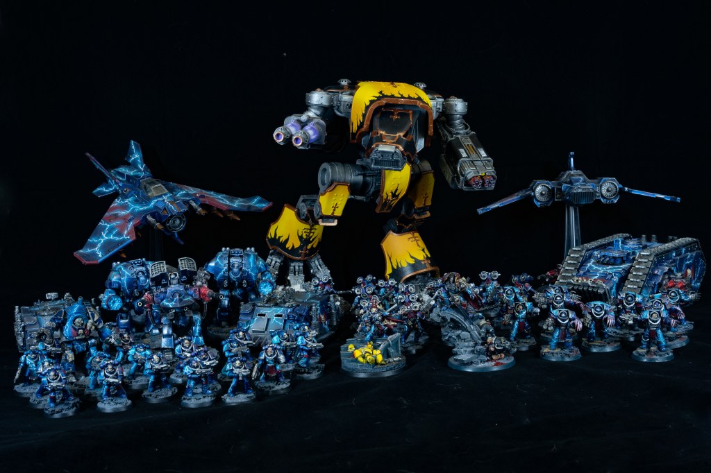
Death Metal – Repeatable Metallic Night Lords
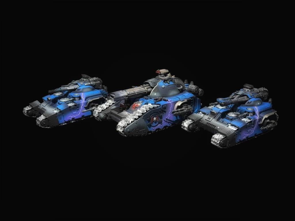
Metallic Night Lords will always hold a special place in my mind and heart – I think they look sick – but they’re difficult to photograph and do justice to the paintjob. The scheme above was the first I was entirely sold on, and one that I keep looking at going back to – with some amendments, and I’ll discuss that here and now. The scheme then, revised for 2026, on how I’d do it:
Base: Vallejo Arctic Blue Metallic 71.071 (Vallejo Game Air Metallics Range)
Layer (2026): Vallejo Sapphire Blue Metallic 77.111 (True Metal Metallic Range)
Shade (2026): Liquitex Ink – Muted Turquoise
Lightning: Vallejo Alien Purple 72.776 (Game Air Range)
Lightning Core: Vallejo Premium White 63.001
Varnish: Vallejo Matte Varnish (Mecha Range)
Trim Base: Vallejo Gunmetal Metallic 77.720 (Metal Colour Range)
Trim Shade: Citadel Nuln Oil
Trim Layer: Vallejo Silver RLM-01 (Model Colour Range)
The addition of the Layer allows you to really pick out specific aspects of the model against that darker, richer Vallejo Arctic Blue, making it naturally more contrasted and also better to photograph. Firing the Muted Turquoise into the shadows, thinly, allows you to deepen the Arctic blue and on occasion blend the Sapphire into the Arctic Blue better. Just remember that the ink isn’t metallic – so you want to go light with it. Muted Turquoise wasn’t always used – I used to use Druchii Violet, so if you wanted to substitute the Liquitex Ink with a Violet from their range, that’d work fine too.
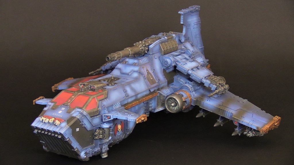
The30KChannel Years – Mid-Contrast Night Lords
After evolving the Metallic scheme for a few years, I changed in 2020 to try to work through a contrast-scheme that evoked that “in midnight clad” aesthetic. Honestly, I don’t think I really captured my imagination – but it served as a REALLY useful learning process throughout the years to get to where I am today. There were a huge number of changes wrought on the army collection over the two years the scheme was worked up – but the baseline was as follows:
Base: Vallejo Black 71.057 (Model Air Range)
Layer: Vallejo Premium White 63.001
Layer: Vallejo Imperial Blue 72.720 (Model Air Range)
Layer: Vallejo Magic Blue 76.021 (Model Air Range)
Varnish: AK Ultra Matte
Trim Base: Vallejo Bronze 70.998 (Model Colour Range – Original Colour discontinued)
Trim Shade: Citadel Nuln Oil
Trim Layer: Vallejo Gold 70.996 (Model Colour Range – Original Colour discontinued)
Lightning was largely absent from this generation – as I never really decided on what I wanted to do. This is largely because the colour is largely too bright on the panels as it stands – and kind of looks more akin to lightning rolling behind clouds. As I said before, I never really got on with this scheme and as a result, I took the lessons learned during this time and rolled it into the current scheme.
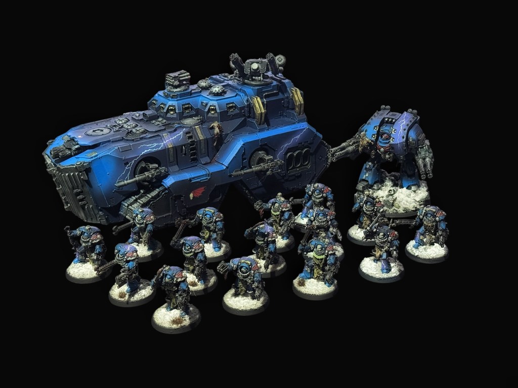
In Midnight Claw – The Judgement Talon Scheme
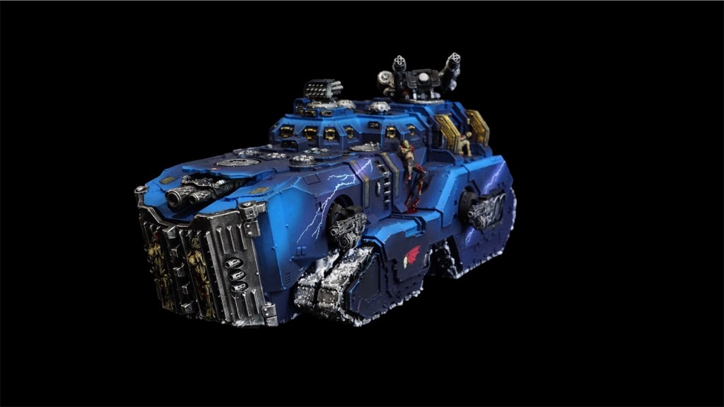
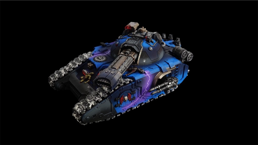
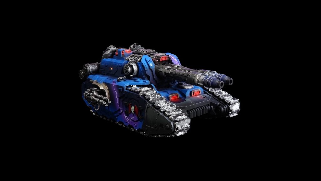
This scheme combines a lot of what I saw on the colour plates in the Black Books I have on the shelf and also reflects a lot of techniques and experiences built up over the years since I started the army. It’s designed to be repeatable en masse, so that I can onboard units for events fairly rapidly and still look good on the table and in photos.
This scheme is also the first time I have gone to brass as a trim colour on my Night Lords – with 2018 being silver and 2020 being a bronze and gold scheme.
The scheme is largely simple:
Base: Vallejo Black 71.057 (Model Air Range)
Layer (Black Areas Only): Vallejo AMT-11 Blue Grey 71.304 (Model Air Range)
Layer: Vallejo Night Blue 76.019 (Model Air Range)
Layer: Vallejo Magic Blue 76.021 (Model Air Range)
Shade: Liquitex Ink – Muted Turquoise
Lightning: Vallejo Alien Purple 72.776 (Game Air Range)
Lightning Core: Vallejo Premium White 63.001
Varnish: AK Ultra Matte
Trim Base: Citadel Brass Scorpion
Trim Wash: Citadel Nuln Oil
Trim Layer: Citadel Runelord Brass
The Process
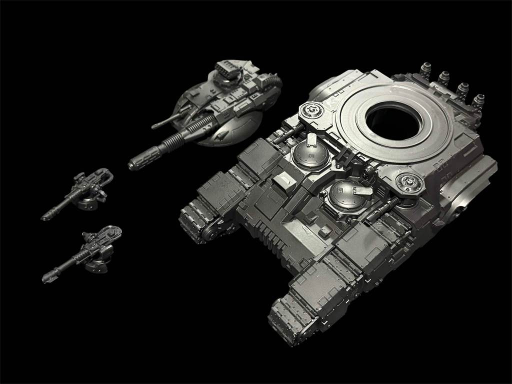
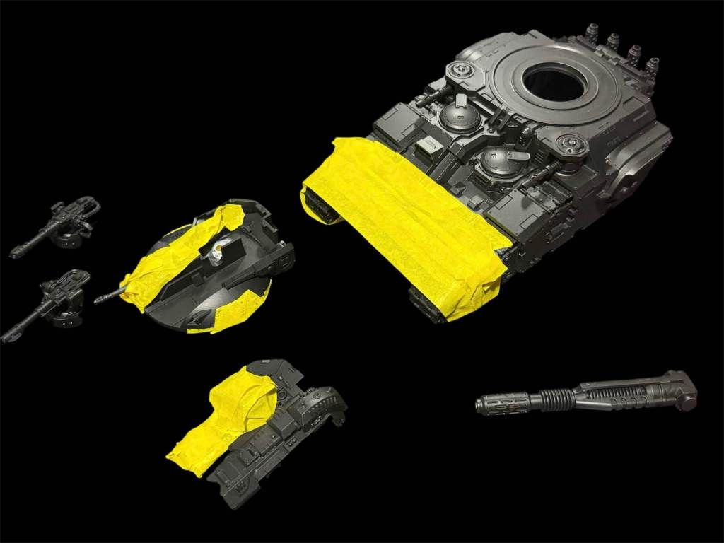
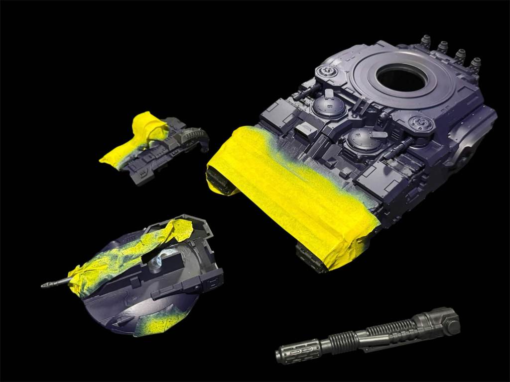
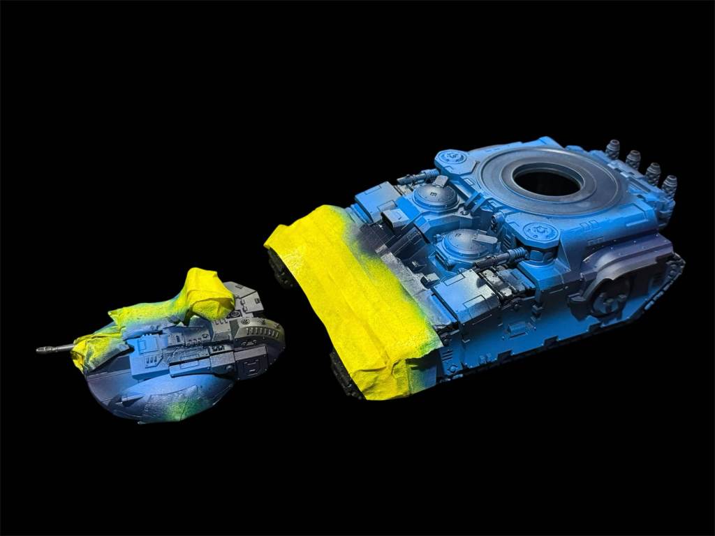
Now here I should have another photo, but it turns out I got painting happy and photo sad – and forgot. The above image already has the Muted Turquoise applied. That’s fired onto the spaces where shadow should be – atop the Night Blue and is used to blend the edge between the Night Blue and the Magic Blue.
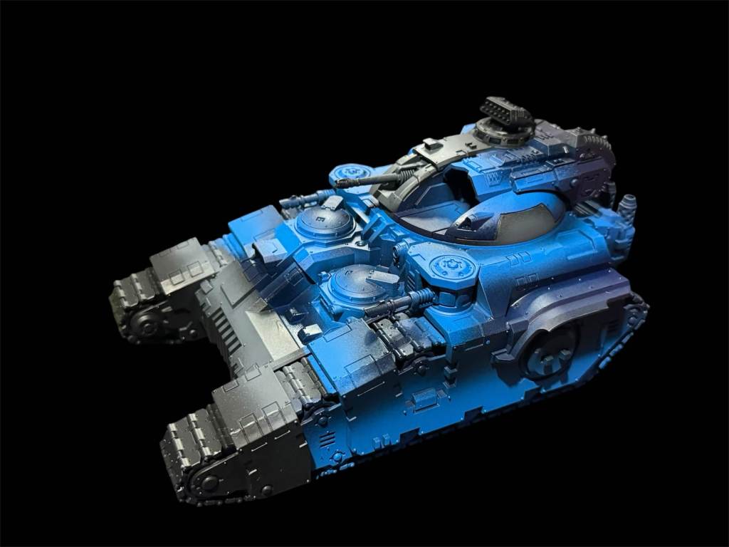
The trim is then painted in Citadel Brass Scorpion, washed with Nuln Oil and then finished with Runelord Brass.
The Future…… And a summary
I love the current scheme, and it has grown with me over nearly ten years – trying to experiment and push my limits. I still adore that metallic scheme though and the more I look at the paint list, the more I want to dive back into metallic army painting. It’s likely I’ll pick up another unit and give it a shot – maybe dust off my Javelins to see what they look like in the scheme. Who knows, maybe in 2027 it’s time to strip everything again and go back to the beginning…
I think “in midnight clad” is a lovely turn of phrase because it can mean literally whatever you want it to. There’s only one other army with such a vast range of colour swatches available to it – and I’ve had them as a main in previous editions – the Sons of Horus. Both Night Lords and Sons of Horus (Sea Green) evoke such a range of colours and techniques for creating them that I would never be so arrogant as to say that my way is the only way – but my process and scheme was asked for over the years on several occasions, and recently too – so it made sense to have a positive blog post chatting about the process and schemes. I hope it’s been useful to read through, even if it’s just boiling down to “I’m not doing that scheme ever”.
I’m looking forward to The Siege of Myraxia Event at Darksphere on the 28th/29th November 2026 where I’ll be breaking out my Night Lords for the last formal narrative event of the year – tickets are still available for that. Then I have a massive Christmas Apocalypse game with my gaming group to see out the year.
AVE DOMINUS NOX!


Leave a Reply